
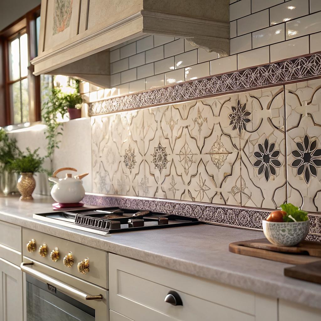

“Cream zellige tiles are too plain. They will make your kitchen look flat and boring.”
This is false. A cream zellige tile can be one of the most interesting surfaces in a kitchen, because the color is quiet but the texture, glaze variation, and handmade feel create movement. If you place cream zellige tile on your walls or backsplash, it will usually make the space feel softer, warmer, and actually more layered, not less. If you are looking for a quick answer on how to use it: run it up the backsplash, keep the grout close in tone, and let the irregular surface catch the light. That alone will lift most kitchens. You can explore a range of options at cream zellige tile, then come back here to figure out where and how to use it.
I used to think cream tiles were a safe, almost dull choice. The kind of thing people pick when they are afraid of color. Then I saw a small kitchen with cream zellige wrapping the whole cooking wall, right up to the ceiling, with simple oak cabinets. It did not feel dull at all. It felt calm, but the light kept shifting across the tiles, so the room never looked the same twice. That changed my mind.
So if you worry that cream means “bland,” it usually means the opposite with zellige. The glaze pools, the edges are a bit irregular, some tiles are slightly warmer, some a bit cooler. Your eye moves across the surface, which is what makes a kitchen feel alive. And it pairs with almost everything: wood, stainless steel, black fixtures, stone, you name it.
Let us go through different ways cream zellige can shape your kitchen, how it behaves with light, what grout works, where to stop and start the tile, and what to avoid so it does not slide into looking too busy or, occasionally, too flat.
Why cream zellige works so well in kitchens
If you have looked at photos of Moroccan zellige, you know it has a very distinct personality. The tiles are small, often square, with an irregular surface and slight color shifts. When you choose cream for that format, you get a quiet color with a lively body.
A few things happen in a kitchen when you bring in cream zellige:
You soften hard lines. Modern kitchens have a lot of straight edges: cabinet fronts, countertops, appliances. The uneven surface and edges of zellige interrupt that a bit. Your walls look more relaxed and less harsh.
You gain warmth without heavy color. Pure white can sometimes feel cold, especially under cool LED lighting. Cream adds a touch of warmth without locking you into strong beige or yellow. If you tend to change your style often, this helps.
You get visual interest that does not fight your cabinets. Strongly patterned backsplash tile sometimes competes with cabinet doors and hardware. Cream zellige mostly sits in the background but still gives depth.
The main strength of cream zellige is the balance between calm color and lively texture. It rarely shouts, yet it never feels flat.
I think this is one reason designers keep using it in new projects. It looks current, but it is based on a very old tile tradition, so it also does not feel tied to a specific trend year.
Cream zellige as a backsplash
Most people start with the backsplash. It is a natural place to experiment, and you can adjust the scale to suit your space.
1. Classic stacked or offset cream zellige backsplash
The simplest idea often works best. Square cream tiles in a tight, regular pattern.
You can stack them directly on top of each other so the grout lines form a grid. That gives a slightly more modern look. Or you can offset them, so joints line up with the center of tiles above and below, which feels more traditional.
If you are not sure which suits your kitchen, think about your cabinet style:
– Flat slab cabinets often work well with stacked tiles.
– Shaker or more detailed cabinets often sit nicely with offset tiles.
Even within this “basic” layout, you can shape the mood of the kitchen with a few choices.
2. How high to run the backsplash
A common hesitation is how far the cream zellige should go. Stopping too low can make the tile feel like an afterthought. Going high can feel bold, but it often looks more intentional.
Here are a few simple height options:
| Backsplash height | When it works best | Effect on the kitchen |
|---|---|---|
| Standard (to bottom of upper cabinets) | Most typical layouts with uppers | Balanced, safe, still benefits from zellige texture |
| Full wall to ceiling | Ranges with no upper cabinets, open shelves, or feature wall | More dramatic, pulls the eye up, makes ceilings feel taller |
| Partial “picture frame” behind range | When you want a focal point behind a stove | Localizes interest, keeps tile spend focused |
If you want your kitchen to feel “designed” rather than just “updated,” taking the cream zellige higher than a basic 4 inch strip usually does far more than a new paint color would.
3. Cream zellige tile backsplash with floating shelves
Using floating shelves instead of upper cabinets can make the cream tiles feel more like a continuous wall finish. The shelf brackets often disappear, and the tile reads as one big surface behind your dishes and glasses.
This works especially well in:
– Smaller kitchens that need to feel more open.
– Kitchens with nice dishware that can live on display.
– Spaces with good natural light that can play across the tile and shelves.
You just have to be honest about how tidy you are. Open shelves plus busy countertops can start to feel cluttered. If you keep daily items simple and repeat shapes (like mostly white plates or clear glasses), the cream background will help calm everything.
Cream zellige and light: what to expect
One reason people fall for zellige in photos is the way it catches light. In person, that effect depends on your windows and your artificial lighting.
In a bright kitchen with big windows, cream zellige often glows. The glaze reflects light at slightly different angles, so you get small shifts tile by tile. You might notice that in the morning the backsplash feels almost white, and in the evening it looks warmer.
In a darker kitchen, the tiles take on a cozier tone. The irregular surface still helps, but you will see fewer strong reflections. Here, a slightly glossy glaze helps keep the wall from going dead.
If you are concerned about how warm the cream will read, look at samples at different times of day.
Always check cream zellige samples under your actual kitchen lighting at night, not just in daylight. That is usually when you cook and when the color really matters.
If your lighting is very cool, the cream might look more neutral and less creamy. If you use warm bulbs, it can lean slightly more beige. Neither is wrong, but you might like one more than the other.
Grout color with cream zellige
Grout is a small detail that changes the whole surface. With cream tiles, grout choices can shift the look from soft and cloudy to sharp and graphic.
Here is a quick comparison.
| Grout tone | Visual effect | When it makes sense |
|---|---|---|
| Matched cream / light beige | Soft, continuous surface, less focus on grid | When you want calm and subtle texture |
| Warm light gray | Visible joints, slightly rustic feel | For a farmhouse or classic European inspired kitchen |
| Darker taupe or mid gray | Strong grid, higher contrast | When you want a graphic pattern and do not mind more “noise” |
Many people assume contrast grout is more “interesting.” Sometimes it just adds visual clutter. With cream zellige, matched or close grout usually lets the glaze variation stand out more than the lines themselves. That is often nicer in a kitchen where you already have cabinet lines and appliances.
If your kitchen gets heavy use and you worry about staining, a slightly darker grout, still within the cream / warm gray range, gives a bit of forgiveness without taking over the surface.
Cream zellige paired with different cabinet colors
You might already have cabinets, or you might be picking everything at once. Cream zellige changes slightly based on what sits against it.
1. Cream zellige with white cabinets
People sometimes worry this will be “too light.” It can be, if you do not add any depth elsewhere. But with the right touches, it feels breathable and clean.
Look for:
– A countertop with gentle movement, like a warm white quartz with thin veining.
– Hardware with some warmth, such as brushed brass, bronze, or a muted nickel.
– A floor that grounds the space, like wood or a mid tone tile.
Here, the cream backsplash adds a hint of warmth between the white cabinets and counter. You avoid the sterile feel that sometimes happens with all bright white surfaces.
2. Cream zellige with wood cabinets
This is one of the most forgiving combinations. The natural variation in wood talks to the variation in the tile, so they feel like they belong together.
Lighter oak or ash gives a Scandinavian inspired mood: simple, quiet, airy. Deeper walnut or stained woods lean more classic and rich.
If you go with a warmer wood, you might want a cream that is a bit more neutral rather than very yellow. That way the whole kitchen does not slide into one heavy warm note.
3. Cream zellige with dark cabinets
Dark blue, charcoal, or nearly black cabinets paired with cream tiles create a strong contrast. The cream becomes the lighter relief between the darker blocks of cabinetry.
This is effective when:
– You want your backsplash to brighten a wall with dark cabinets.
– You like contrast but not sharp, icy white.
– You want to highlight the shapes of your cabinets.
In this mix, the cream zellige reflects more light and keeps the room from feeling heavy. You get a bit of drama without needing a colored tile.
Where to use cream zellige beyond the backsplash
Most people think only of the backsplash, but cream zellige can go into other parts of the kitchen as well.
1. Full feature wall in cream zellige
If you have one main wall that carries your range and hood, tiling the whole wall in cream zellige can anchor the kitchen.
You do not need upper cabinets on that wall. You can place:
– A simple plaster or metal hood.
– A floating shelf or two for everyday items.
– Wall sconces mounted directly on the tile.
This makes cooking feel more like standing at a feature wall rather than at a random stretch of units. If your kitchen opens to another room, guests often see this wall first, so it works as a visual backdrop.
2. Cream zellige inside a niche or open shelf section
Sometimes you do not have the budget or desire to tile a whole wall. In that case, tiling a smaller area can still make an impact.
Good spots for this:
– Inside a recessed niche behind the cooktop.
– The back of a coffee station area.
– The wall behind open shelves inside a tall cabinet frame.
Because cream is not a loud color, these tiled pockets feel intentional but not too attention grabbing. You get detail where you stand often, such as when you make coffee every morning, which can feel quite pleasant.
3. Waterfall or partial return on the side of cabinets
You can carry cream zellige around the edge of the backsplash to cover short return walls, for example next to a window or beside a tall cabinet. This avoids abrupt paint transitions and frames the run of cabinets.
It is a small shift, but your eye reads the tile as wrapping the space, which feels more finished.
Can you use cream zellige on the floor in a kitchen?
People ask this a lot. It is a fair question, because zellige has an uneven, slightly fragile glazed surface. For a busy kitchen floor, some types of zellige might chip under heavy impact. Others are rated for light floor use. This is where you need clear information from the supplier.
If the cream zellige you like is suitable for floors, think about:
– Slip resistance, especially if you cook a lot and spills are common.
– Cleaning, since cream can show dirt more than mid tones.
– How the floor scale works with your cabinet layout.
In most cases, cream zellige shines more as a wall tile in kitchens. For floors, many people prefer a sturdier porcelain or a natural stone look alongside the zellige on the walls. That split often gives you the best of both worlds: practical underfoot, character at eye level.
Combining cream zellige with other materials
The success of a cream zellige kitchen often comes down to what you pair it with. A nice tile can still feel off if the countertop or hardware fight it.
1. Countertops that pair well with cream zellige
A few countertop directions tend to sit well next to cream tiles:
– Warm white quartz with subtle veins. This keeps things soft and easy to clean.
– Light marble or marble look, if you are comfortable with patina.
– Mid tone soapstone or similar, for contrast with a softer edge.
– Honed limestone or other light stones, when you like a more natural, aged feeling.
Highly speckled or very busy stone patterns can clash with the slight variation in the tile. If the tile has character, it usually helps if the countertop is calmer, or vice versa.
2. Metals and hardware
Cream loves a bit of contrast in metal finishes. Think about:
– Brushed brass or muted gold for warmth.
– Aged bronze or black for crisp lines.
– Brushed stainless if you like a cleaner, simpler look.
If all your metals are the same shiny chrome and your tiles are soft cream, the hardware might feel a bit cold next to them. A brushed or aged finish usually ties in better with the handmade feel of zellige.
3. Wood tones and furniture
If your kitchen includes an island with seating or a dining table in the same room, wood can connect the spaces. Medium, slightly desaturated woods often match cream tiles well. Very red or very orange woods can push the room toward a dated look if paired with a strong yellow cream.
You do not need an exact match. You just want the undertones to agree: warm with warm, or neutral with neutral.
Design ideas by kitchen style
To make things more concrete, here are a few paths for different styles. These are not strict rules, just starting points.
1. Modern minimal kitchen with cream zellige
Picture flat white or pale gray cabinets, no visible handles, and a simple worktop.
– Use stacked cream zellige in a neat grid.
– Choose a grout close to the tile color.
– Keep outlets and switches as low profile as possible, in a pale finish.
– Let the only strong accent be perhaps a black faucet or dark bar stools.
Here the tile provides almost all the texture in the room. You do not need pattern elsewhere. The kitchen feels modern but not cold, which is a hard balance to hit with flat cabinets.
2. Warm “European” inspired kitchen with cream zellige
If you like kitchens that feel collected, almost a bit old world:
– Pair cream zellige with shaker cabinets in a muted color like mushroom, putty, or warm gray.
– Choose light warm gray grout for a slightly rustic feeling.
– Add a stone or stone look countertop with gentle movement.
– Use simple brass knobs and classic sconces over the backsplash.
Here, the cream tile feels at home. It does not scream “new” but also does not look fake-old. The slight irregularity in the glaze echoes traditional kitchens without copying them exactly.
3. Small apartment kitchen with cream zellige
If your kitchen is compact, tile can make a big difference in perceived space.
You might:
– Tile from countertop to ceiling on the main wall, even if it is short.
– Keep cabinets simple and let the cream tile be the main finish.
– Use open shelves instead of some uppers to reduce bulk.
– Stick to a simple flooring in a mid tone so the room does not feel chopped into layers.
The light reflection from the tiles can make a small kitchen feel less cramped. I have seen narrow galley kitchens that felt almost double their size after tiling the long wall in light zellige.
Practical questions: cleaning and daily use
People sometimes worry cream tile will stain or be hard to clean. That depends more on the grout and the quality of the glaze than the color itself.
– Glazed zellige usually cleans with a gentle tile cleaner and a soft cloth or sponge.
– The grout benefits from sealing, especially behind cooktops where splashes happen.
– If you cook with a lot of oil or tomato sauces, a slightly darker grout tone can reduce visible staining over time.
Cream can show some marks more than darker tiles, but you also see dirt sooner and clean it, which is not always a bad thing. A backsplash is mostly vertical, so it does not collect as much grime as a floor.
I would not base the whole decision on fear of cleaning. Many people live with cream tiles for years and find the maintenance acceptable, especially compared to unsealed natural stone.
Common mistakes with cream zellige in kitchens
No material is magic. There are a few missteps that can make cream zellige less successful.
1. Too many focal points at once
If your cabinets are a strong color, your countertops are heavily patterned, your lighting is very decorative, and then you add textured tile, the room can start to feel restless. Something has to play a quieter role.
Often the best move is to let the cream backsplash and the cabinets be the main story, with a calmer countertop and simple hardware. Or, if the countertop is the star, keep the rest soft and supporting.
2. Ignoring the undertone of the cream
Not all cream is the same. Some lean more yellow, some more pink, some more gray. If you pick tiles without comparing to your cabinet and counter samples, you might end up with slightly clashing undertones.
Lay your samples next to each other and look at them in your actual light. If something looks off, it usually is. Trust that reaction.
3. Stopping the tile at awkward points
Short little backsplash runs that stop before a window or end mid wall can break the visual flow. When you plan the tile, think of natural end points:
– Corners
– Bottom of cabinets or shelves
– Ceiling
– Edge of a tall cabinet or the end of a run of base units
When the tile stops at a logical point, the whole kitchen looks more coherent.
Frequently asked questions about cream zellige in kitchens
Is cream zellige too trendy for a long term kitchen?
I think trends are harder to predict than people pretend, but cream as a color is very stable. The handmade look of zellige is traditional, not new. What feels current right now is using it in larger, simpler fields rather than busy mosaics.
If you keep the layout clean and avoid very “of the moment” cabinet colors, a cream zellige backsplash is likely to age quite well. It might not feel cutting edge in ten years, but it should still feel pleasant and familiar.
Will cream zellige clash with my existing granite counters?
It depends on the granite. If your granite has a lot of strong color and busy pattern, cream tiles that are too soft and varied might compete. On the other hand, if the granite is mostly neutral, cream can calm it.
A simple test:
– Put a tile sample next to the granite.
– Step back and squint a bit.
If your eye jumps back and forth in an uncomfortable way, there might be too many competing patterns. In that case, a smoother, less variegated tile might work better, or a cream with a more solid tone.
Can I mix cream zellige with white appliances?
Yes. White appliances next to cream tiles tend to make the cream look warmer, which many people like. The only time it looks odd is when the cream is very dark and the white is very bright, and there is nothing in the room to bridge the two.
If you repeat the white in trim or some accessories, the relationship feels intentional. Or introduce a countertop that is somewhere between the two tones to soften the jump.
Is cream zellige too subtle if I like color?
Not necessarily. You can still bring in color through:
– Painted cabinets.
– Bar stools and textiles.
– Artwork or accessories.
– A colored range or hood.
The cream background often makes those colors look better, because it does not fight them. If you like to change color accents every few years, cream tiles give you a stable backdrop for that.
Cream zellige tiles are not a compromise for people afraid of color. They are a quiet anchor that lets you change the rest of the kitchen over time.
If you keep that in mind, you can build a kitchen that feels calm today and still gives you room to adjust things later without starting from scratch.
